Thoughts on Text to Speech tools?
I used Speechify to read out my blog post. I actually really enjoy text to speech, I’ve used it before and it’s very helpful to get through readings. However, I still prefer narration done by real voices from real people. I’m just not able to connect fully with augmented narration on a personable level.
Accessibility wise, Text to Speech software is super useful for those who are visually impaired. Additionally, there are a lot more new ways that even AI is being integrated into Text to Speech software by generating voices from old recordings, which is a beautiful tool for those who have lost their voice.
What does inclusive design mean to you?
Inclusivity is creating the safest space you can for everyone, no matter your race, religion, sexual orientation. I usually would say I “will create a safe space”, however, I’ve been reflecting on what one of my professors said at the start of this semester about the idea of safety being subjective, and that having a definite safe space will differ from person to person. With that being said, I want to create the safest space that I can, and I will try my very best to make my blog inclusive and accessible for everyone.
Canva Poster:

Which design principles did you use to create your infographic in Canva?
This is my first time using Canva, and I focused on the making the colours of The Medicine Wheel the center of attention. The Medicine Wheel in itself already utilizes four colours so I wanted to minimize any further colours that would cause the poster to clash and look unstructured. I played around with the principle of Contrast in my decision making processes. Initially, I made the red portion have white text and graphics (in order to balance it out). However, I felt that it stood out too much, and so I settled on black.
At first, I was unsure about the simplistic design but I settled on it after careful consideration. Graphic design does take predominantly western ideologies of what is deemed as beautiful. When creating a graphic about cultural teachings, I felt it was important to keep it equally culturally sensitive by not splurging it with clipart. Overall, I’m happy with the design choices of the silhouettes of the animals so their essence is still present, without overshadowing the teachings.
What additions could be made to ensure that learners with visual impairments have access to the same information in an infographic in an online setting?
The main thing I’d like to add would be some elements of audio. Graphic design has its limits, especially in this context. After all, Indigenous pedagogy has been done through oral tradition for generations.
(On a side note, I’d like to highlight that this poster is one of many interpretations of The Medicine Wheel teachings, and it does not encapsulate a pan-Indigenous point of view. Teachings of The Medicine Wheel will vary from nation to nation and this poster does not conclude its definition.)
WAVE Accessibility Report:
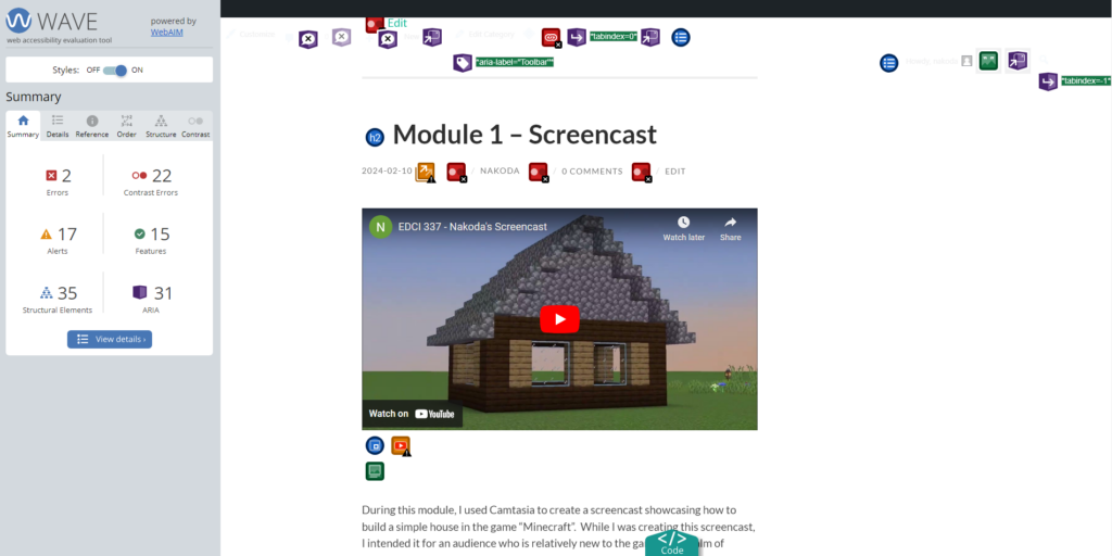
What did you find when you ran WAVE on your blog post?
I never took into consideration the entire scope of design elements. Sometimes visually pleasing design can forfeit accessibility to those who are visually impaired. After my WAVE Accessibility Report, it’s noted that I have quite a lot of contrast errors. It can feel a little hard on the eyes so I actually took some time to reconfigure some of the visual elements of my blog. I realize that my blog was subtly exhibiting some of the “Death by Powerpoint” paradigms so configurations were definitely needed. It’s much more appealing now.
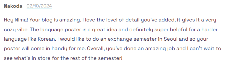
Module 2 Comment:
Leave a Reply
You must be logged in to post a comment.